Premium
Branding Services
South Africa
Branding Services South Africa reamains a competitive market, so your business needs more than just a logo to stand out; it requires a cohesive Brand Identity Design that communicates trust, authority, and innovation. At Web Design Pros, we specialize in crafting professional Branding Identity Services that align your visual presence with your strategic business goals.
Whether you are a startup looking for an essential visual kit or an established SME requiring a comprehensive corporate identity system, our process ensures your brand is built for longevity. From strategic color palettes and custom typography to high-tech digital assets, we provide the foundational elements that allow your brand to scale seamlessly across all platforms.
Partner with a branding expert who understands the unique local landscape and is dedicated to elevating your professional image to a global standard.
Strategic Brand Identity Design & Professional Branding Services
Market Research & Strategic Discovery
Before we even touch a design tool, we dive deep into your industry landscape to identify the “white space” your competitors have missed. Our Brand Identity Design process begins with a comprehensive audit of your market positioning in South Africa. We analyze your audience’s pain points and your business goals to ensure the final visual direction isn’t just aesthetic, but a functional tool for growth and customer acquisition.
Visual DNA & Aesthetic Architecture
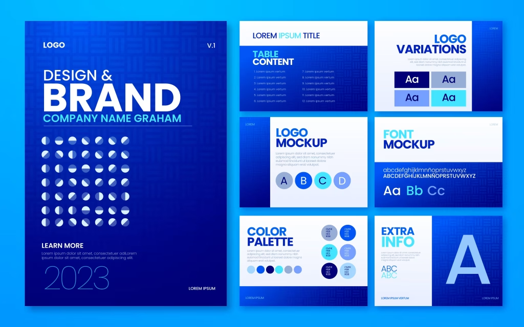
We craft a unique Visual DNA that commands respect and builds instant recognition. This involves more than just a logo; we develop a signature color palette—like the high-tech gradients seen in our own branding—and custom typography that reflects your brand’s personality. Every element is chosen to ensure your Branding Services deliver a premium look that resonates with high-value clients across Gauteng and beyond.
High-Performance Digital Assets
In a digital-first economy, your brand assets must perform as well as they look. We specialize in creating lightweight, high-resolution SVG graphics and digital assets optimized for lightning-fast web performance. From your website’s hero section to your social media presence, we ensure your Corporate Identity remains crisp, modern, and professional on every screen size without compromising on site speed.
Comprehensive Brand Guidelines
A premium brand is defined by its consistency. To protect your investment, we provide a detailed Brand Style Guide that serves as your business’s visual constitution. This manual covers everything from logo clear zones to secondary keyword usage in your marketing. It ensures that as your business scales, every touchpoint—from email signatures to large-scale signage—remains perfectly aligned with your established professional image.
The Evolution of an Icon
Before we dive into our design process, let’s look at the giants. The history of the Microsoft identity is more than just a series of logo changes; it’s a masterclass in how a brand adapts to stay relevant in an ever-shifting digital landscape. From the retro-futurism of the “Blibbet” to the unified ecosystem of the modern grid, each era reflects a strategic shift in how technology connects with people. Explore the milestones that shaped one of the world’s most recognizable brands and see why a purposeful brand identity is the foundation of every successful business.
1975
The Story: Microsoft’s debut reflected the 1970s disco scene. Designed with concentric lines and “groovy” rounded edges, it captured the youthful, trend-heavy energy of the early Albuquerque startup scene.
The Lesson: Trends expire. While perfect for 1975, this look quickly became a relic. At Web Design Pros, we balance modern flair with timeless principles to ensure your identity doesn’t require a total rebrand every few years.
1980
The Story: As the PC wars began, Microsoft pivoted to a “rock star” aesthetic. Featuring sharp angles and aggressive diagonal slashes, the logo was designed to communicate speed, disruption, and a high-performance edge as they prepared to dominate the home computer market.
The Lesson for Your Brand: Your visual identity is a psychological “mood setter.” This era proved that sharp lines and deliberate angles can command authority and signal innovation. At Web Design Pros, we choose every curve and edge with intention to match your business’s specific “energy” and market position.
1982
The Story: In 1982, Microsoft introduced a logo that would become a cult favorite: the “Blibbet.” The standout feature was the stylized letter “O,” which featured a series of horizontal lines meant to represent motion, data, and the digital pulse of the burgeoning software industry. It was high-tech, geometric, and perfectly captured the transition from hobbyist computing to a professional global powerhouse.
The Lesson for Your Brand: The Blibbet reminds us that details matter. That single “O” became the entire identity of the company for five years. When we design for your business, we look for that one “hero” element—like a custom squiggle or a unique font weight—that makes your brand instantly recognizable even before someone reads the name. A great brand isn’t just a name; it’s a visual signature.
1987
The Story: This italicized logo with its famous “slash” in the ‘O’ defined Microsoft for a quarter-century. It was bold, stable, and implied a sense of forward motion during the company’s massive global expansion into every home and office.
The Lesson For Your Brand: Consistency builds equity.A logo that lasts decades generates immense trust. At Web Design Pros, we design with longevity in mind – creating professional assests that scale with your growth without needing a “refresh” every two years.
2012
The Story: In 2012, Microsoft retired the italicized “Pac-Man” look after 25 years. They introduced a clean, geometric four-square grid alongside the Segoe UI typeface. This wasn’t just about looking modern; it was about unification. Whether you were on a Windows Phone, an Xbox, or a PC, the brand felt identical. It was the birth of the “flat design” movement that still dominates the web today.
The Lesson for Your Brand: The modern Microsoft era proves that Consistency is Power. A brand shouldn’t look different on a business card than it does on a website. When Web Design Pros builds your brand identity, we ensure that every “touchpoint”—from your favicon to your footer—speaks the same visual language. We don’t just design logos; we build unified systems that grow with your business. Much the same as we do with our Professional Web Maintenance packages.
Our Approach to Branding Services South Africa
Discovery: We analyze your market to provide branding services South Africa competitors can’t match.
Strategy: Building a foundation that justifies your premium branding services South Africa investment.
Execution: Crafting the visuals (like the Microsoft logos above) that define your legacy.
Fequently Asked Questions.
Why are professional branding services South Africa essential for new startups?
First impressions are everything. Professional Branding Services South Africa help startups establish immediate credibility and trust in a competitive local market.
How do your branding services South Africa compare to DIY design tools?
While DIY tools offer templates, our branding services South Africa provide custom, strategic identities designed to scale, ensuring you don’t look like everyone else.
Can I update my existing logo with your Branding Services South Africa?
Yes! We offer brand refreshes as part of our branding services South Africa, modernizing your look while keeping the equity you’ve already built.
What industries do your Branding Services South Africa focus on?
We provide versatile Branding Services South Africa across various sectors, from tech startups in Randburg to professional service firms nationwide.
Do your branding services South Africa include social media assets?
Absolutely. Every package within our branding services South Africa includes optimized assets for platforms like Facebook, Instagram, and LinkedIn.
How does brand identity impact SEO for Branding Services South Africa?
A strong brand increases “brand searches.” When people search for you by name, Google sees you as an authority, which is a core focus of our branding services South Africa.
Are your branding services South Africa affordable for small businesses?
We offer tiered packages, making high-quality branding services South Africa accessible for small businesses looking to grow into mid-market leaders.
What is the first step in starting with your branding services South Africa?
Every project begins with a discovery call. This ensures our branding services South Africa are perfectly aligned with your specific business goals.
Do you offer brand guidelines with your branding services South Africa?
Yes, we provide a comprehensive “Brand Bible” with all our Branding Services South Africa so you can maintain consistency across all future marketing.
Why is Web Design Pros the best choice for Branding Services South Africa?
We combine technical web expertise with creative strategy, delivering Branding Services South Africa that don’t just look good but actually convert visitors into clients.
Web Design Pros is a premier boutique digital agency in Randburg, Johannesburg . We specialize in engineering High-Performance Digital Assets for South African Growth.
B-BBEE: Level 1 Contributor
CIPC Registered: 2026/282129/07
SARS Tax Compliant
Quick Links
- Home
- Services Portfolio
- Get a Quotation
- Contact Us Directly
Our Services
- Starter Website
- Business Website
- Website Redesign
- Website Maintenance
- Graphic Design
- Social Media Marketing
- Branding Services
About Us
- Northcliff, Randburg, Johannesburg
- 075 221 6842
- info@webdesignpros.co.za
Compliance
- Download B-BBEE Certificate
- Download CIPC Certificate
- Download SARS Certificate